Mas Subramanian’s global journeys often involved accompanying his wife, Rajeevi, to art museums. For a long time, however, he found little to detain him amongst the canvases. While Rajeevi could immerse herself for hours in the works of Monet and Picasso, he typically preferred the company of a book. His stance was simple: “You go and see everything. I’ll sit around and read.”
Both chemists by training, their professional lives, and indeed their passions, diverged significantly. Rajeevi nurtured a love for art, creating intricate sketches and watercolors. Mas, meanwhile, established a solid career in materials science at DuPont, accumulating a substantial portfolio of publications and patents. Paintings simply did not capture his interest.
This detachment shifted dramatically in 2008. It was then that art and chemistry unexpectedly converged within his own laboratory. While engaged in the synthesis of novel materials for computer applications, Subramanian serendipitously encountered a striking blue pigment. This accidental discovery proved to be a pivotal moment, not only altering the trajectory of his career but also subtly transforming his perception of art.
Suddenly enthralled by the underlying chemistry of color, he began to grasp a long-standing challenge in the art world: throughout history, achieving vibrant, light-fast colors proved exceedingly difficult. The most successful pigments were often found by chance rather than deliberate design. For Subramanian, this inherent difficulty presented an irresistible scientific puzzle.
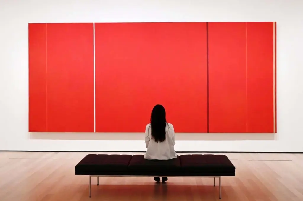
His focus narrowed intensely onto color, driven by a determination to understand the precise atomic structures responsible for its appearance. His laboratory subsequently yielded pigments across a spectrum of hues. Yet, a singular prize continues to elude him: “the perfect red,” a vivid, enduring shade capable of brightening any display wall.
Red, historically, has presented a less formidable challenge. Early artists relied on crushing iron oxide-rich rocks and mixing them with animal fats to produce red paints. These mineral pigments, while robust, offered a muted palette. The “red cow” depicted in the Lascaux cave paintings, dated approximately 20,000 years ago, still registers as a reddish-brown today.
What has consistently proven elusive is a red that is simultaneously brilliant and remarkably durable. For centuries, the most vibrant inorganic reds owed their existence to toxic metals such as cadmium or mercury. However, with the increasing restrictions on these materials, finding viable replacements has become an unexpectedly arduous task. Subramanian notes, “It’s easy to explain a color after you find one. But I’m not able to ask any theoretician, ‘Can you do a calculation to tell me which compound will produce a red color?’”
In theory, the problem appears straightforward. A material appears red because it reflects red light while absorbing green and blue wavelengths. Yet, in practice, the most captivating pigments are those that exclusively reflect the desired color, without any spectral bleed. This precise control is contingent upon the atomic arrangement within the material.
This is precisely why iron oxides, utilized in cave paintings, produce serviceable but dull reds. Their inherent chemical structures permit unwanted portions of the light spectrum to penetrate, diminishing the vibrancy of the color. As Gerhard Pfaff of the Technical University of Darmstadt, Germany, explains, “It really depends on the interaction with the light.”
During the Middle Ages, an alternative approach to achieving bright red emerged with “red lakes.” These were paints formulated from carbon-based molecules rather than mineral crystals like iron oxide. Medieval artisans derived these organic compounds from cochineal beetles or plants such as rose madder, yielding remarkably vivid pigments.
Despite their brilliance, organic pigments are inherently unstable and have a limited lifespan. Red lakes became known as “fugitive pigments” due to their tendency to fade. This trade-off persists even today. David Peggie, a chemist and paint analyst at The National Gallery in London, points out that organic pigments can be modulated to create nearly any shade. While this is acceptable for household paints, he questions its suitability for demanding applications like automotive finishes. A contemporary Ferrari’s iconic red, derived from organic sources, necessitates expensive UV-protective coatings to prevent its characteristic luster from diminishing, a consequence of organic pigments’ significant susceptibility to fading.
Consequently, a distinct need persists for a safe, inorganic red pigment that successfully marries brilliance with permanence. Subramanian attests to the market potential, stating, “Many companies told me that if you have the red pigment, you can be a billionaire.” The global market for inorganic pigments already exceeds $28 billion annually.
For Subramanian, however, his journey into the realm of color did not commence with red. It began with blue. This particular color would prove to be both an educational revelation and, at times, an elusive pursuit.
Throughout most of art history, painters had a limited selection of reliable inorganic blues. Egyptian blue, a calcium copper silicate synthesized in antiquity, alongside a sparse collection of naturally occurring blue minerals, shouldered much of the responsibility for providing blue hues. Even the advent of modern chemistry contributed surprisingly little to expanding this palette. Peggie observes, “There were serendipitous discoveries and there was a lot of trial and error.”
One such accidental discovery occurred in 1706. Johann Jacob von Diesbach, a dye maker, inadvertently produced Prussian blue after using contaminated potash in a recipe intended for a red lake to create violet. A century later, chemists developed cobalt blue, a pigment highly prized for its use in Chinese porcelain and which remains a staple to this day. However, the broader takeaway was that exceptional blues were rare and tended to emerge through chance.
Subramanian’s own significant blue pigment shares this history of fortuitous discovery. In his current office, he wears a shirt that closely matches the shade of the pigment he identified: YInMn blue, a synthesis of the metals yttrium, indium, and manganese. He has recounted the story of its discovery countless times, yet he still speaks of it with a discernible spark of enthusiasm.
Following two decades at DuPont, Subramanian relocated to Oregon State University in 2006 to dedicate himself to independent research. At that juncture, his primary interests lay in superconductors and electronic materials, not pigments. Thus, when a brilliantly hued blue substance emerged from his furnace one day, it was entirely unplanned. His research funding at the time was designated for the discovery of materials for data storage. He humorously admits, “If I’d written a proposal saying, ‘I’m going to discover a blue pigment’, they may not have given me the money.”
Working alongside his graduate student, Andrew Smith, Subramanian was involved in synthesizing crystals where manganese atoms adopted an unusual configuration, encircled by oxygen atoms arranged in a shape reminiscent of two triangular pyramids joined at their bases. The geometry was unconventional; the resultant color, unexpected. However, Subramanian possessed sufficient knowledge of pigment science, gleaned from colleagues in DuPont’s pigment division, to recognize the significance of his finding. True, stable blues of this nature were both rare and highly valued.
The striking hue quickly garnered attention. Manufacturers of paints adopted it. Artists, including Rajeevi, utilized it to depict vivid blue jacaranda trees and majestic blue herons. The pigment also attracted interest for its potential as a reflective coating designed to cool buildings.
“It’s absolutely a good blue. No doubt about that,” affirms Pfaff. Nevertheless, its commercial trajectory was likely constrained by the cost of its constituent elements. As Pfaff notes, “the elements it is made from ‘aren’t the cheapest.’”
For Subramanian, the discovery held importance for another reason entirely: it propelled him into the specialized domain of pigment chemistry, revealing the profound extent to which color is dictated by atomic structure. Over the subsequent decade, he systematically substituted elements within the YInMn framework, leading to the creation of new green, purple, and yellow pigments.
However, blue, he would come to realize, was the more accessible achievement. The innovative techniques that facilitated his exploration across the majority of the color spectrum began to falter as his attention shifted to the most challenging hue of all.
Red, Subramanian understood, represented a formidable challenge—one that could not be overcome merely by selecting the appropriate elements. Chemists have long acknowledged that the same atom can produce markedly different colors depending on its chemical bonding. Chromium, for instance, imparts a green hue in emeralds but a red one in rubies, a distinction solely attributable to variations in atomic arrangement within each crystal.
Ultimately, color is determined by the interaction of light with electrons. When light impacts a pigment, its energy can incite electrons to transition to a higher energy state. The specific electron transitions that are permissible—and consequently, which wavelengths of light are absorbed versus reflected—are dependent on the material’s atomic-scale structure. Electrons might transition between atoms, for example, or between energy levels within the same atom. In YInMn blue, Subramanian discovered that its intense color originates from electrons hopping between particular regions surrounding manganese atoms known as their d orbitals, effectively absorbing red and green light from the spectrum.
Predicting which electron jumps will occur, however, is difficult. These transitions are influenced by subtle factors: the distances between atoms, their existing electron density, and the governing principles of quantum physics. In numerous crystalline structures, these principles prohibit the very transitions that would yield vibrant colors. Rather than confronting this complexity directly, Subramanian began investigating methods to circumvent it—exploiting unique aspects of atomic geometry that permit quantum rules to be subtly manipulated.
This strategic approach led him to chromium, but in a form distinct from that present in certain gemstones. In 2024, his research led him to compounds containing chromium in the rare Cr²⁺ state. The electron orbitals in this state are arranged similarly to those of manganese in YInMn blue. However, Cr²⁺ is more commonly found on the moon than on Earth, where it typically exhibits insufficient stability. Subramanian recounts, “I was told when the Russians and US went to the moon and got some moon rock, they found Cr²⁺ there because of the very low oxygen content.”
Inspired by this information, he reduced the oxygen concentration in his furnace to levels approximating those found on the moon. This allowed him to coax Cr²⁺ into unconventional crystalline structures, where the chromium atoms are situated within flat square formations. The outcome was not the elusive red he sought, but it was a significant step forward. Some compounds manifested as “reddish-magenta,” suggesting he was indeed on the correct path.
What connects these near-misses to YInMn blue is the disruption of symmetry. Quantum rules typically preclude electrons from readily transitioning between d orbitals in highly symmetrical environments. However, in YInMn blue, the manganese atoms reside within a distorted, double-pyramid arrangement that alleviates these restrictions. In the moon rock surrogates, meanwhile, the asymmetry arises from persistent molecular vibrations that deform the square environments of the chromium atoms. When the symmetry of these squares is compromised, the electrons readily shift their positions. This same principle underpins the coloration of Egyptian blue.
Empowered by this understanding, Subramanian has continued to engineer asymmetry into his pigments, deliberately encouraging these typically forbidden electron transitions. More recently, he revisited the double-pyramid configuration, this time employing nickel, although he laments that the resulting color is “only orange.”
Because transitions between d orbitals seldom produce a pure, bright red, he is also pursuing a parallel strategy. Instead of relying exclusively on subtle electron movements within atoms, he is experimenting with semiconductor materials that absorb light when electrons entirely depart from their orbits—akin to their behavior in the canary-yellow (though toxic) cadmium sulfide.
Despite these efforts, progress remains somewhat uncertain. Subramanian admits he is still “somewhat playing the dice.” He conveys this sentiment to his students: “‘Just make it.’ We can talk about it all day, but… make it, and if it works, it works – and if not, we move on to the next.”
Pfaff acknowledges that Subramanian’s atomic-level approach is theoretically sound and “good from a theoretical point of view.” However, he adds that a truly successful red pigment must also demonstrate resilience against humidity, sunlight, and scalable manufacturing—criteria that have led to the failure of other promising candidates.
A fortunate turn of serendipity may yet be required. Regardless of the ultimate outcome, Subramanian himself has undergone a notable transformation. When he now visits art museums, he no longer retreats into his book. He accompanies his wife to appreciate the artwork. “I’ve changed my whole view about these artistic colours,” he states. His path may have been unconventional, but he has finally discovered a compelling reason to connect with and appreciate paintings.